What is a Chart?
A trading chart is visual data of price movement in the various timeframe, drawn in the vertical(X) and horizontal(Y) axis. The vertical axis represents the time, and the horizontal axis represents price volatility. It is a 2 dimension picture which depicts the past and current price of an asset or instruments.
Chart reflects the price movement, and the market participants determine it. Market participants make trading decision base on multiple reasons. It can be technical, fundamental, and sentimental reasons.
Therefore, chartist believes that the price of an asset reflects all these information and psychology of the market participants. And it is the most important tool and data for technical analysts to predict short-term future and place orders to gain profit.
Technical indicators like moving average and oscillator are the byproduct of the price movement on the chart. Plus, It also forms a certain pattern like Head and Shoulder and Ascending Triangle for traders to find an appropriate entry and exit point.
What are the types of Chart?
1.Line Chart
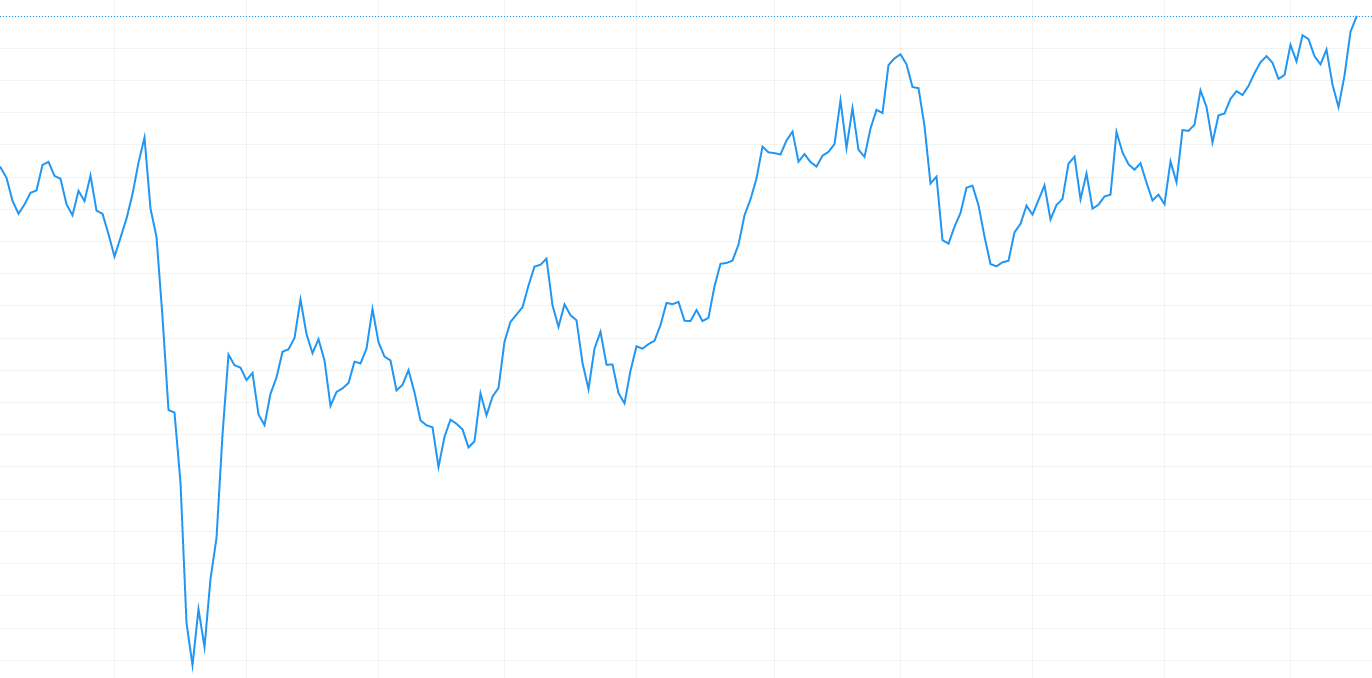
Line Chart is a type of chart which shows the price data in the form of straight-line segments. It is a basic and common form of chart which visualize a trend in data over time series. It is an amazing way to see the exact value but poor way to understand the underlying patterns that those values represent. This is a direct way to know the trend of the market but to know the exact pattern, other forms of charts are recommended.
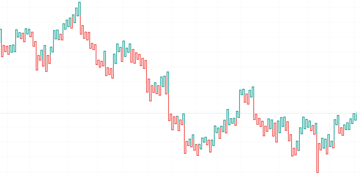
2. Bar Chart
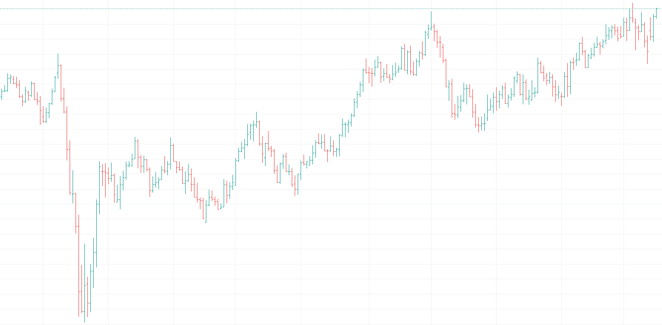
The bar chart shows the number of price bars which tracks how prices moved over time. It typically shows OHLC(Open, High, Low and Close) prices which helps trader to monitor and make trading decisions. It enables traders to analyze trends, reversals, volatility, price movement and patterns. Difference between bar chart and candlestick is how it looks. Candlestick has something called real body which represents the same information but visually different.
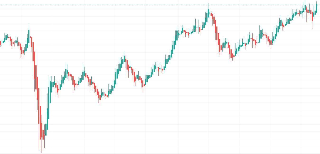
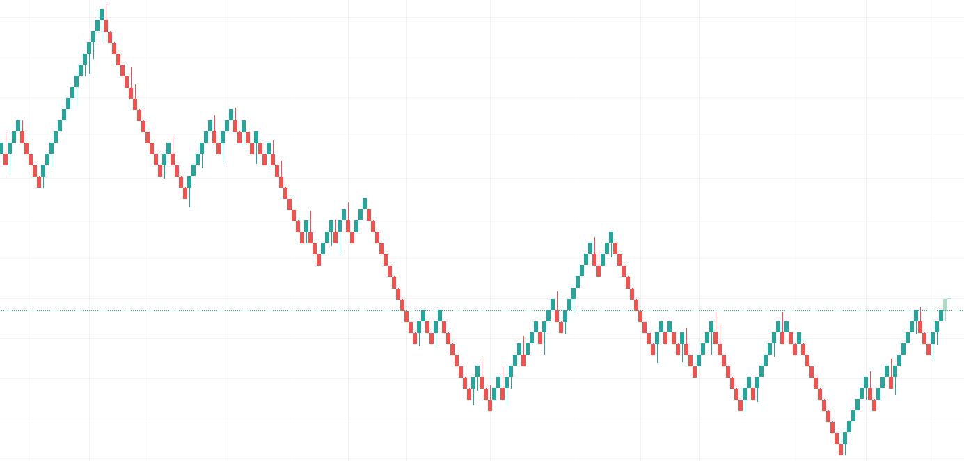
3.CandleStick Chart
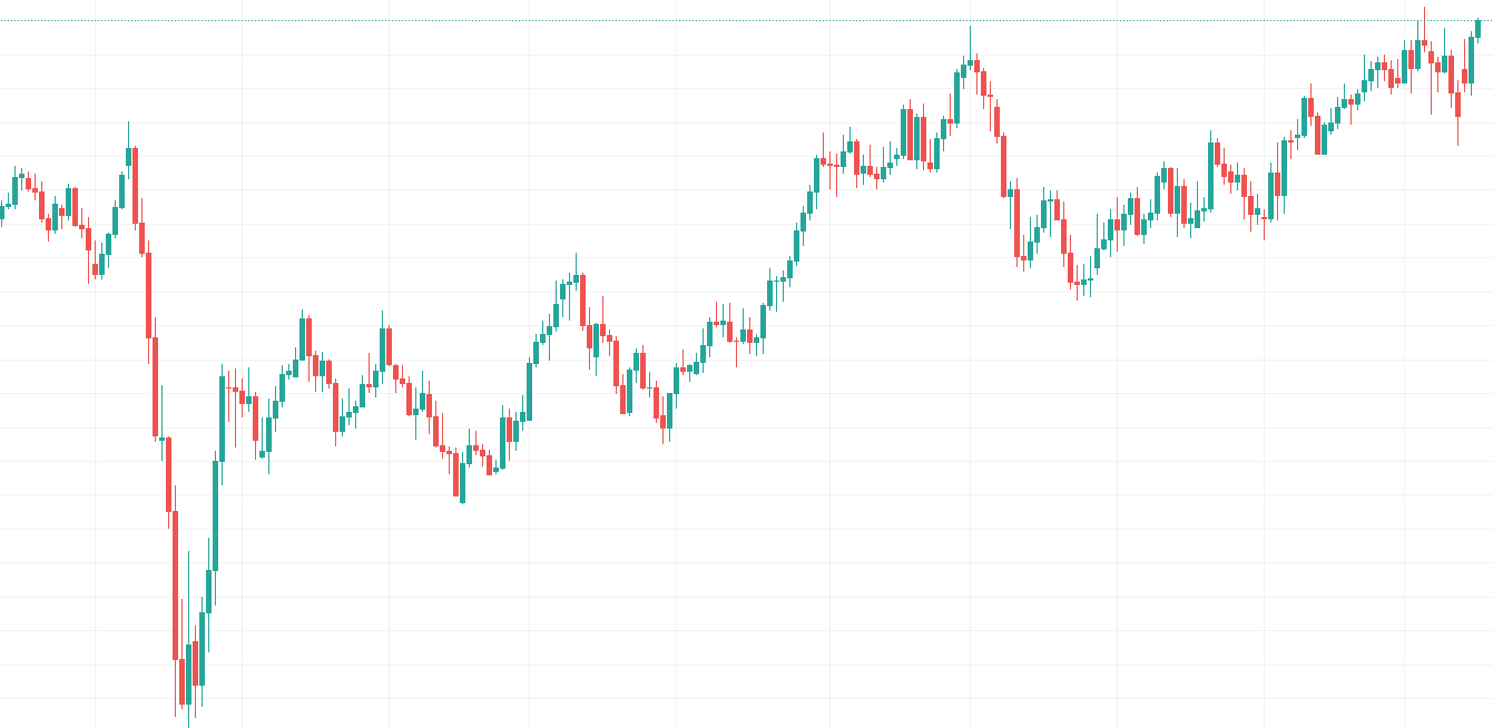
Candlestick chart was developed in the 1700s by a Japanese man named Homma, a rice trader. He realised the psychology of people influences the market, and candlestick visually depicts the size of price movement and emotion with different colours. Today, It is used by traders to determine possible price movement based on past patterns. The body and tail offer an insight into how market participants think and reflect supply & demand within the market.
4.Heikin-Ashi Chart
Heikin-Ashi is a form of chart which averages price data to create a Japanese candlestick to exclude the noise. Instead of using OHLC(Open-High-Low-Close), it uses a modified formula based on two-period averages which gives a smoother appearance. It is intended to make it easier to spot trends and reversals. But, it also neglects gaps and some price data with averaging which may not reflect actual price and could affect risk. Daytraders who need responsive price data might not find Heikin-Ashi useful due to its drawbacks.
5.Renko Chart
Renko chart is designed to use price movement rather than both price and time. Renko means brick in Japanese and the chart looks like a series of bricks. New brock is formed when the price moves a specified price amount in 45-degree angles to one another. Renko chart does have a time axis, but the time scale is not fixed. Some bricks may take longer to form than others which depends on how long it takes to form another brick. So, Renko charts do not show much detail like a candlestick and could give false signals. It is useful to know the trend of the price movement, but not for short-trading.
6.Kagi Chart
Kagi chart uses a series of the vertical line to illustrate the level of supply and demand for certain assets. Thick lines are drawn when the price of the underlying asset breaks above the previous high prices and is interpreted as an increase in demand for the asset. Thin lines are used to represent increased supply when the price falls below the previous low. Kagi chart is independent to time and only change direction once a predefined reversal amount is reached. It is effective in signalising clear paths of price movements but hard to use in day-trading.
What are the Technical Indicators?
Technical indicators are indicators to predict future price movements by using historical data like price and volume. The active trader widely uses it as they are developed to analyze the short-term price movement. But, long term investors can also use technical indicators to identify entry and exit points.
The chart shows the price movement over time, and technical analysts have been developing indicators upon it. There are two major types of indicators, Overlay and Oscillator. Let’s see what those indicators are!
Overlay
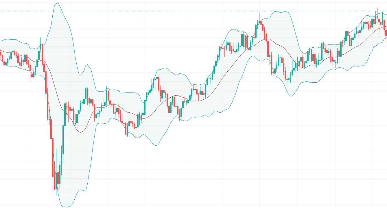
Overlays are the technical indicators that utilise the same scales as prices are plotted over the top of the prices on a stock chart. Examples of overlays are moving average and Bollinger bands.
Oscillator
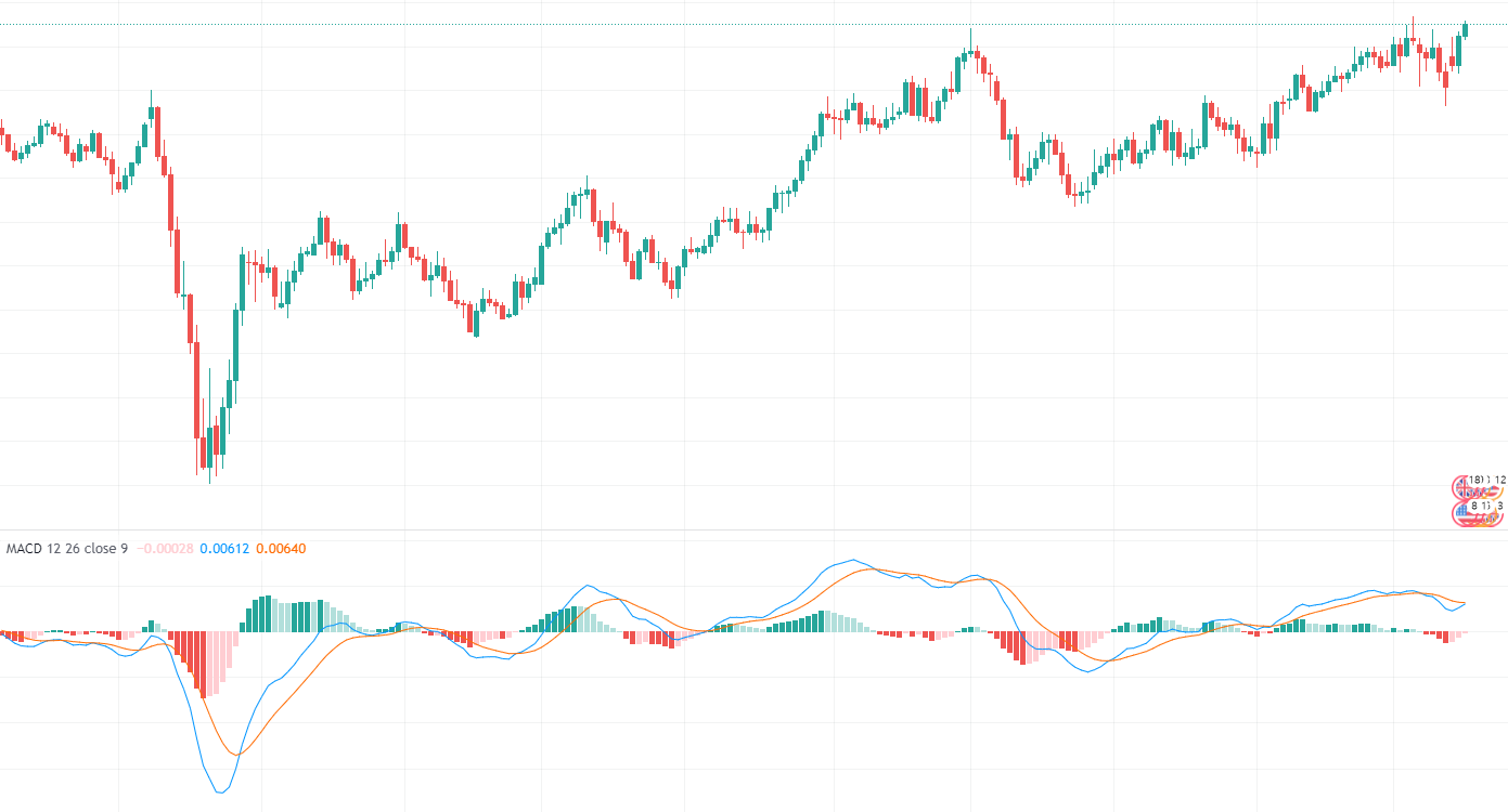
Oscillators are indicators that oscillate between a local minimum and maximum are plotted above or below a price chart. Examples of overlays are stochastic and MACD.
Takeaways:
- Traders utilise different kinds of technical indicators that work best for them. A combination of indicators is often used for short-term trading.
- Traders also use chart patterns along with indicators to enhance performance.
- Indicators can also be used in the automated trading system due to its quantitative nature.
What are the Chart Patterns?
Chart patterns are patterns which occurs and repeats over a period of time by the market participants. These are commonly used as either continuation or reversal signals and play a huge role in technical analysis.
Continuation Patterns
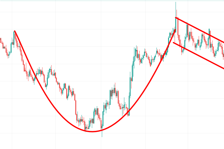
1. Cup with Handle
A cup and handle is a chart pattern that looks like a cup and handles. The cup is in the shape of “U” and the handle is slight downward drift. It is considered a bullish signal and an opportunity to buy.
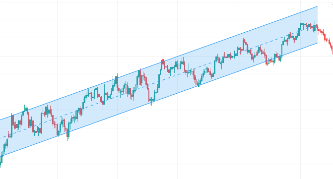
2. Trading Channel
A trading channel is a parallel trendline with support and resistance levels. It is useful to identify the best price to buy or sell since It catches short term directional changes in the market.
3. Flag and Pennant
A flag and pennant is a price pattern that moves like a flag. It is used to identify the possible continuation of a previous trend from a point at which price has drifted against that same trend. Traders look to enter long or short positions when a breakout occurs.
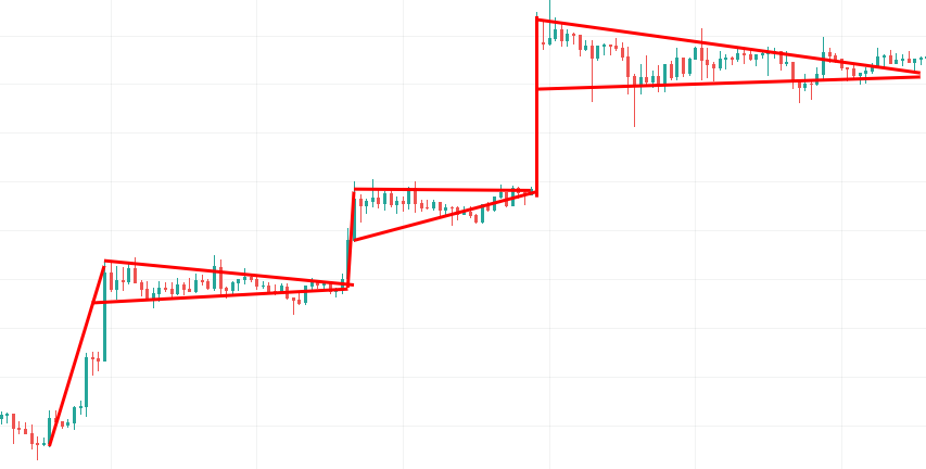
4. Triangle
A triangle is a chart pattern that depicts trendlines along with a converging price range. There are upper and lower trendline completes two corners to create the triangle. The upper trendline is formed by connecting highs and the lower trendline is formed by connecting the lows.
Reversal Patterns
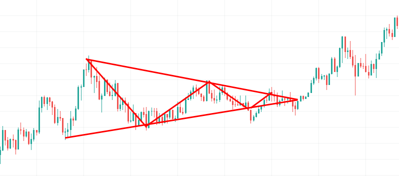
1. Head and Shoulders
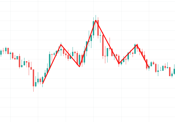
Head and shoulders pattern is a pattern with three peaks, the two peaks outside are close in height and the middle one has the highest height. It is one of the most reliable trend reversal patterns with a high level of accuracy.
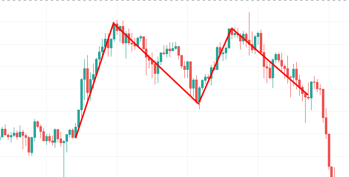
2. Double Top
A double top is a bearish pattern that is formed after the price reaches a high price two times with a decline between the two highs. It is very useful when identified correctly. Otherwise, we could misunderstand the pattern and resulting losses.
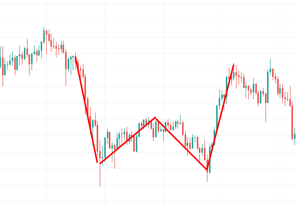
3. Double Bottom
A double top pattern describes the change in trend from the previous price. It is best to analyze mid to longer-term of a market for accuracy. It could be considered as a downtrend signal.
Conclusion
A chart is a tool which visualises the price data in the X&Y axis. The most widely known and used the shape of the chart is a bar and candle chart with OHLC(Open-High-Low-Close). The body and tail of the chart contain information like supply & demand and psychology of market participants.
The price moves up and down, forming the chart pattern over time. These chart patterns are classified into two major categories; Continuation and Reversal. Along with the body and tail shape, chart patterns also offer information and hint to enter or exit positions.
Overall, the chart is the most important tool for technical analysts. For the fundamental and quantitative analyst, this is still a very useful tool to analyze the market in the long-term. Studying the chart analysis will be helpful no matter which means of approach an investor is utilising.